Chapter 5 ggplot2
You can skip this chapter if: * You are confident using the
ggplot2 package
-
You can use the
geom_bar,geom_pointandgeom_histogramarguments -
You can customise a ggplot2 object
5.1 Why ggplot?
There is a fierce debate in the land of R. Some people think basic R should be taught first. Others think that you should learn how to do more complicated things first.
I think you should start to learn ggplot2.
ggplot2 is a really great way to learn R, and particularly the tidyverse approach to coding. It also makes beautiful charts. All my charts in the last chapter (even the dreaded pie chart) were made in ggplot2.
5.2 Building a ggplot object (a scatterplot)
First - open an R Script or RMD file and load the tidyverse package:
Let’s choose the diamonds dataset (from ggplot2 - you can check this by running ?diamonds), and take a look.
## # A tibble: 6 × 10
##   carat cut       color clarity depth table price     x     y     z
##   <dbl> <ord>     <ord> <ord>   <dbl> <dbl> <int> <dbl> <dbl> <dbl>
## 1  0.23 Ideal     E     SI2      61.5    55   326  3.95  3.98  2.43
## 2  0.21 Premium   E     SI1      59.8    61   326  3.89  3.84  2.31
## 3  0.23 Good      E     VS1      56.9    65   327  4.05  4.07  2.31
## 4  0.29 Premium   I     VS2      62.4    58   334  4.2   4.23  2.63
## 5  0.31 Good      J     SI2      63.3    58   335  4.34  4.35  2.75
## 6  0.24 Very Good J     VVS2     62.8    57   336  3.94  3.96  2.48
The diamonds dataset is really big and has lots of
variables. This makes it good for learning ggplot2 because you can
continue using the same example dataset even when we need lots of
variables.
However, sometimes your PC might be a bit slow in rendering some of these charts. Be patient with it - especially when you see the red ‘stop’ sign in the top right of the console window.
We want to take the diamonds dataset and then
(|>) send it to ggplot. In
ggplot we will use the aesthetics argument
(aes) to tell R what to put on the x axis and
the y axis.
What do you think this code will do?
Try this code first!
This code ends up giving us a blank chart. This seems strange until you figure out that ggplot works by layering elements of a chart on top of one another:
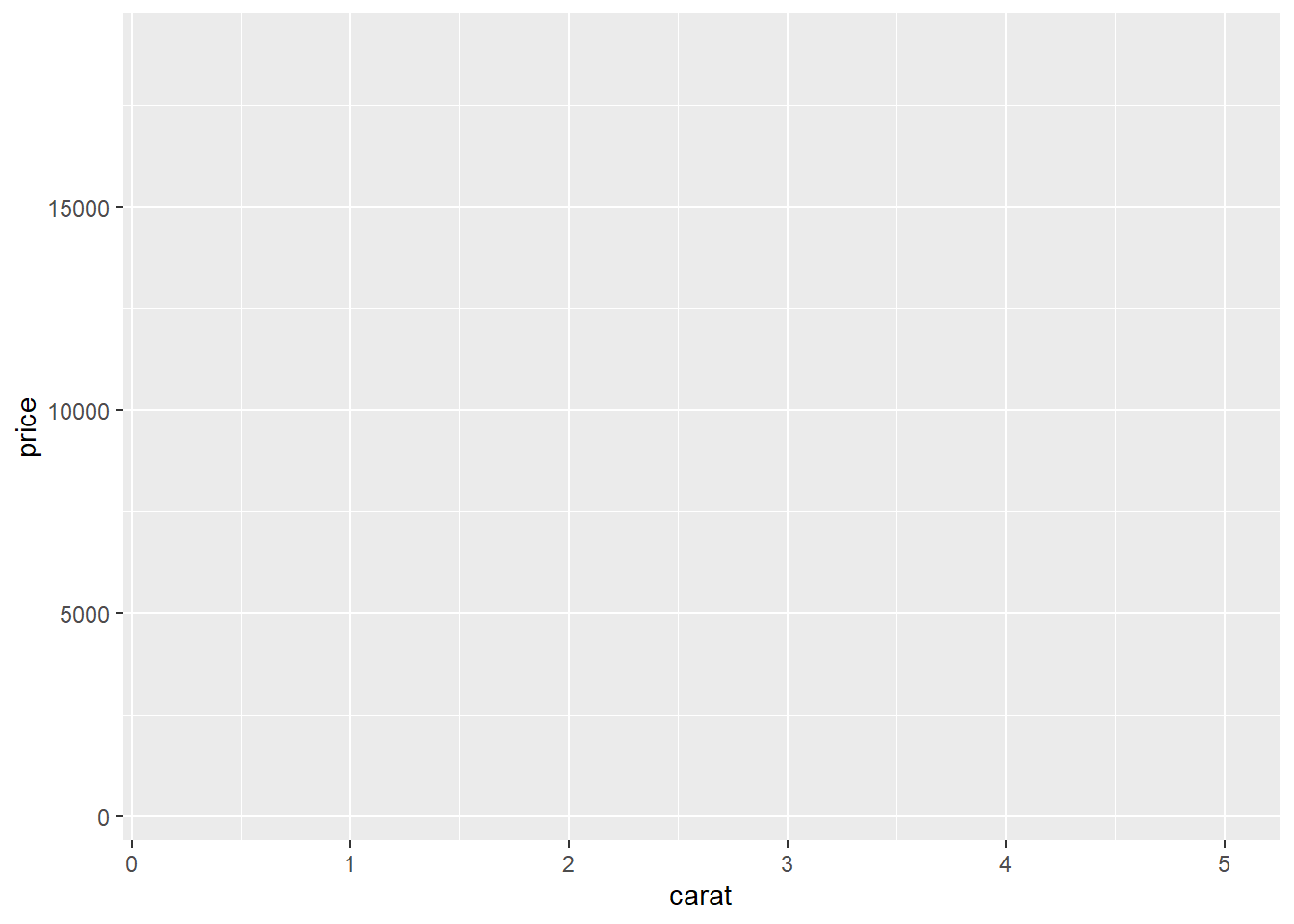
Figure: 5.1: A ggplot object with no geom layers
We need to tell R to add a geom layer, and we do that by adding a +. You may be interested to know that the + symbol is a precursor to the |> symbol. Both ggplot2 and tidyverse were mainly written by Hadley Wickham who has spoken about why ggplot won’t ever use the pipe symbol. In this case, we want to add a geom_point layer, so we write the following:
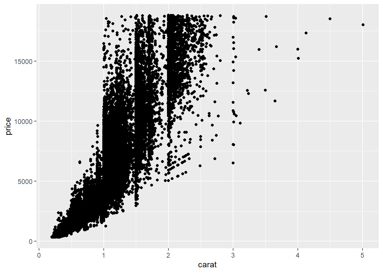
Figure: 5.2: A ggplot object with a geom_point layer, the price of diamonds by their carat
Look at how quickly and easily that worked. With three lines of code, you created a chart of 50,000 datapoints.
That must make you wonder what else you can do . . .
5.2.1 Changing an axis in ggplot2
Let’s change the x axis on this chart. At the moment, we have a ‘tick’ mark at every carat, but what if we want to have a ‘tick’ mark at every 0.5 carats?
All we need is another line of code.
diamonds  |>
ggplot(aes(x = carat, y = price)) +
geom_point() +
scale_x_continuous(breaks = seq (0, 5, 0.5))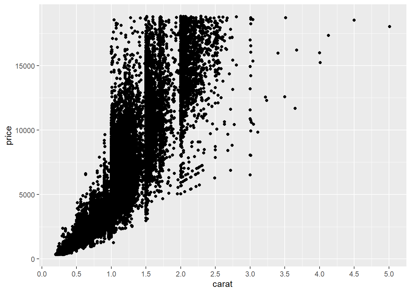
Figure: 5.3: A ggplot object with a geom_point layer, the price of diamonds by their carat, x axis changed
The scale_x_continuous line reads:
Take the last three lines of code and then (+) * Change
the scale of the x axis (scale_x_) which is a continuous
(scale_x_continuous) variable.
-
Change the numbers along the axis (
breaks =) to a sequence (seq) -
The sequence starts at
0, goes to5, and the spaces between them should be0.5
We can go further by changing the limits within thescale_x_ command …
diamonds |>
ggplot(aes(x = carat, y = price)) +
geom_point() +
scale_x_continuous(breaks = seq (0, 5, 0.5), limits = c(0, 6))
Figure: 5.4: A ggplot object with a geom_point layer, the price of diamonds by their carat, x axis changed
Now we’ve told R:
-
Change the scale of x
-
Set new limits on x (
limits =) -
The limits are a vector of two numbers together (
c()) -
Start at
0and end at6
However, you’ll notice that the numbers don’t go all the way to the end. Have you spotted our mistake?
We need to change the seq command earlier in the argument…
diamonds  |>
  ggplot(aes(x = carat, y = price)) +
geom_point() +
scale_x_continuous(breaks = seq (0, 6, 0.5), limits = c(0, 6))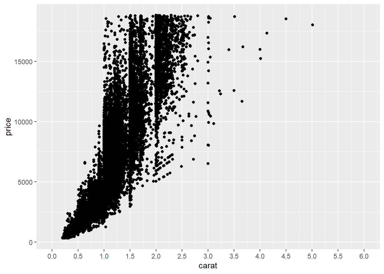
Figure: 5.5: A ggplot object with a geom_point layer, the price of diamonds by their carat, x axis changed
And we can change the y axis in much the same way:
diamonds  |>
  ggplot(aes(x = carat, y = price)) +
  geom_point() +
scale_x_continuous(breaks = seq (0, 5, 0.5), limits = c(0, 6)) +
scale_y_continuous(breaks = seq(0, 20000, 2500), limits = c(0, 20000))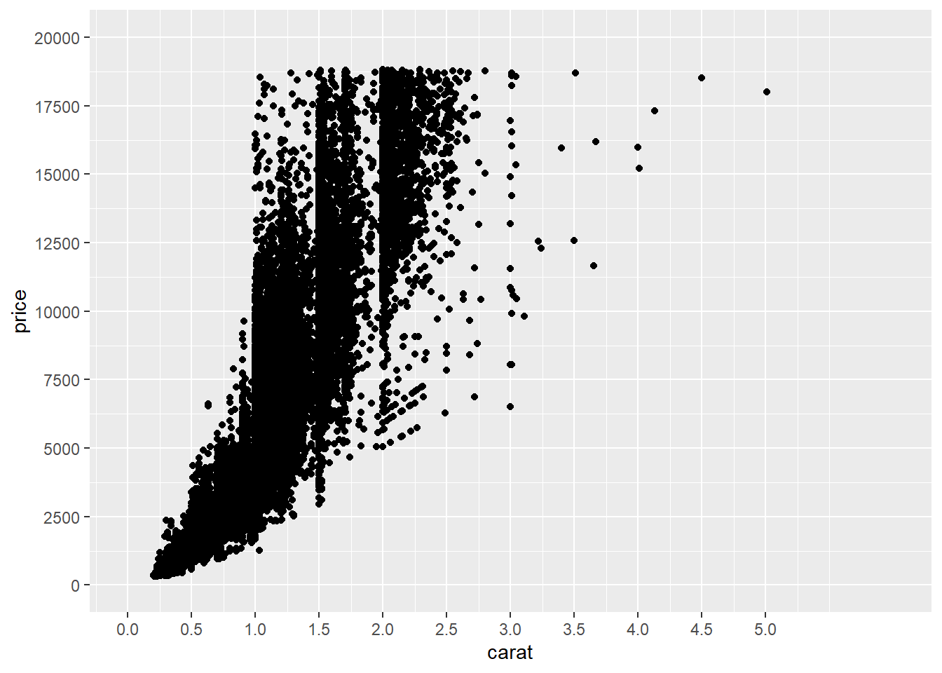
Figure: 5.6: A ggplot object with a geom_point layer, the price of diamonds by their carat, x and y axes changed
5.2.2 Changing themes
Themes are a very cool way to quickly change the look of and customise your charts. Just like everything else in ggplot, we just want to add another layer of code.
diamonds  |>
  ggplot(aes(x = carat, y = price)) +
  geom_point() +
scale_x_continuous(breaks = seq (0, 6, 0.5), limits = c(0, 6)) +
scale_y_continuous(breaks = seq(0, 20000, 2500), limits = c(0, 20000)) +
theme_bw() 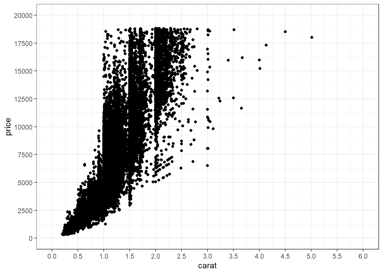
Figure: 5.7: A ggplot object with a geom_point layer, the price of diamonds by their carat, black & white theme
There are lots of different themes in ggplot. If you run that code again you can change theme_bw() to any of the following:
theme_classic()theme_grey()theme_light()theme_linedraw()theme_minimal()theme_void()
Which one do you prefer?
Personally, I like this option:
diamonds  |>
  ggplot(aes(x = carat, y = price)) +
  geom_point() +
  scale_x_continuous(breaks = seq (0, 6, 0.5), limits = c(0, 6)) +
  scale_y_continuous(breaks = seq(0, 20000, 2500), limits = c(0, 20000)) +
theme_classic() 
Figure: 5.8: A ggplot object with a geom_point layer, the price of diamonds by their carat, classic theme
5.2.3 Changing labels and titles
Now we’ve changed axes, plot area, and gridlines, why don’t we give this beautiful plot some labels?
If you were to take a wild guess at how to change labels - what would you add to the plot? Remember, taking the time to stop and try these exercises will help you learn R. And remember that R Studio will autocomplete things you type - what happens if you start to type ‘labels’?
We can adjust labels with the following extra line of code.
diamonds  |>
  ggplot(aes(x = carat, y = price)) +
  geom_point() +
  scale_x_continuous(breaks = seq (0, 6, 0.5), limits = c(0, 6)) +
  scale_y_continuous(breaks = seq(0, 20000, 2500), limits = c(0, 20000)) +
  theme_classic() +
  labs (x = "Carat (a measure of diamond weight)")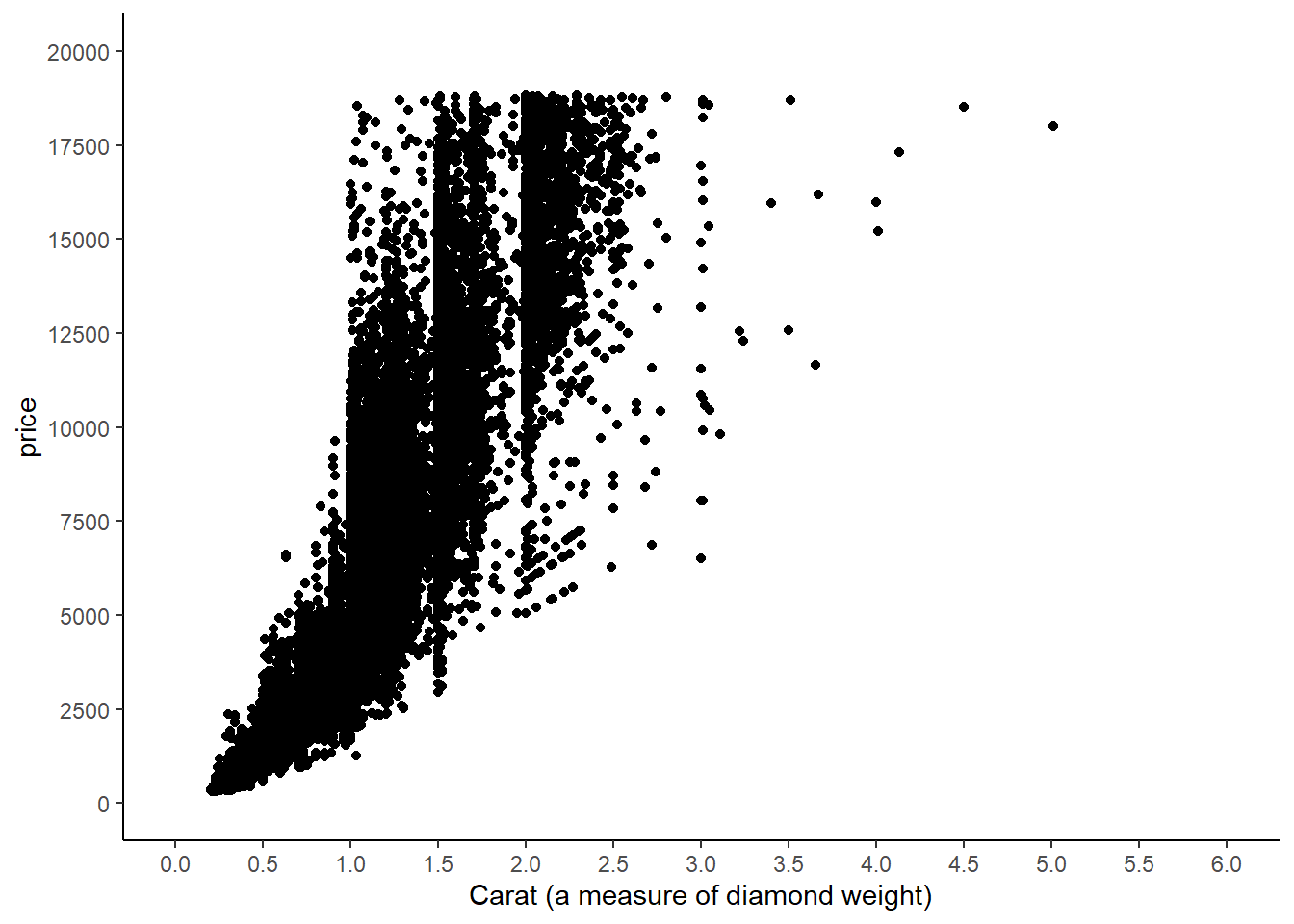
Figure: 5.9: A ggplot object with a geom_point layer, the price of diamonds by their carat, adjusted labels
Unsurprisingly, if we want to change the y axis label, we just need to add another argument inside the labs().
diamonds  |>
  ggplot(aes(x = carat, y = price)) +
  geom_point() +
  scale_x_continuous(breaks = seq (0, 6, 0.5), limits = c(0, 6)) +
  scale_y_continuous(breaks = seq(0, 20000, 2500), limits = c(0, 20000)) +
  theme_classic() +
  labs (x = "Carat (a measure of diamond weight)",
        y = "Price in US dollars ($)")
Figure: 5.10: A ggplot object with a geom_point layer, the price of diamonds by their carat, adjusted labels
You can even add in titles and subtitles.
diamonds  |>
  ggplot(aes(x = carat, y = price)) +
  geom_point() +
  scale_x_continuous(breaks = seq (0, 6, 0.5), limits = c(0, 6)) +
  scale_y_continuous(breaks = seq(0, 20000, 2500), limits = c(0, 20000)) +
  theme_classic() +
  labs (x = "Carat (a measure of diamond weight)",
        y = "Price in US dollars ($)",
        title = "Price of >50,000 round-cut diamonds",
        subtitle = "Data from ggplot2 package")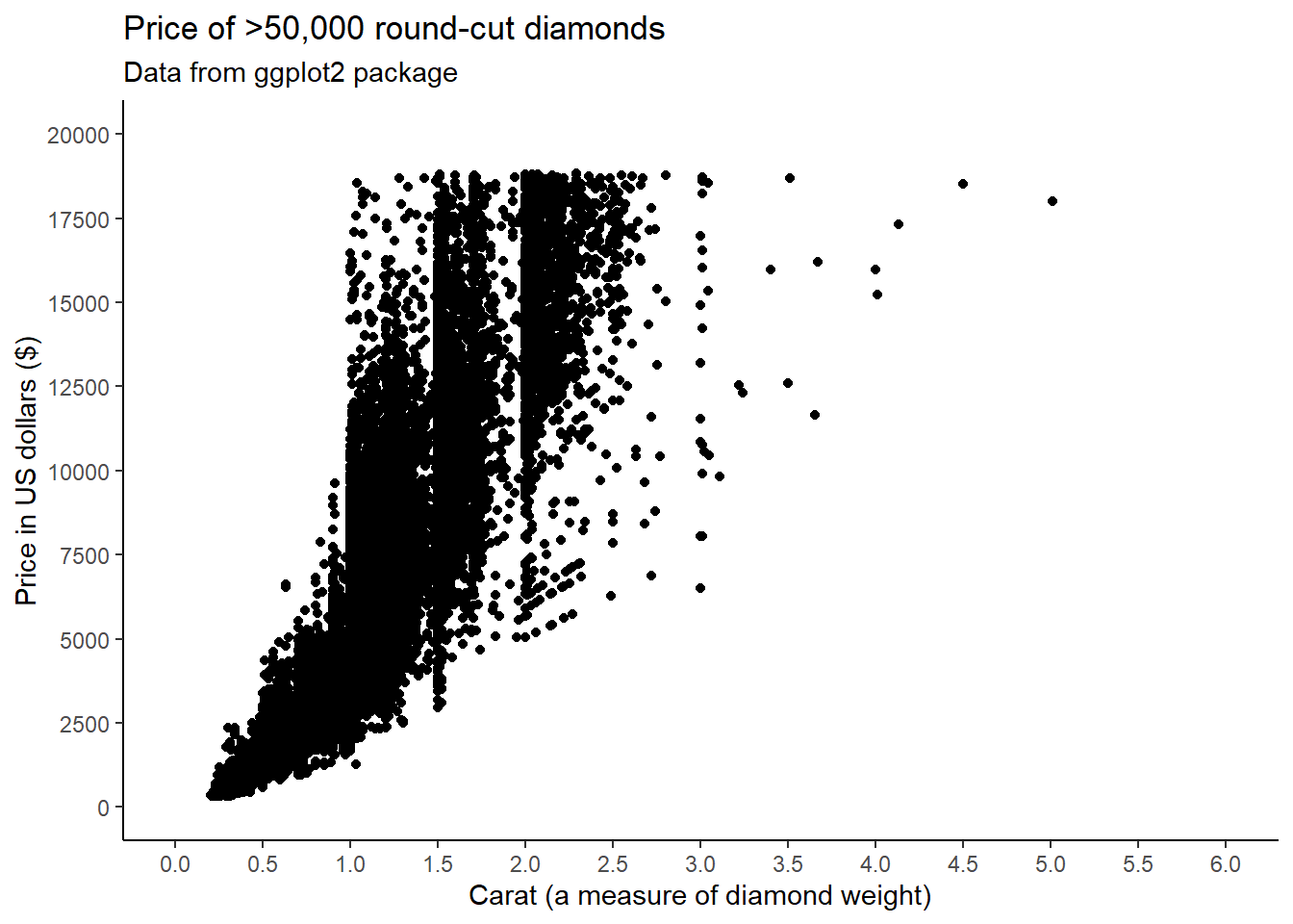
Figure: 5.11: A ggplot object with a geom_point layer, the price of diamonds by their carat, adjusted labels
5.2.4 Adding regression lines to ggplot
It seems as though the bigger the diamond is, the more you pay for it, so why don’t we add a line of best fit to demonstrate this?
This is so easy to do in R.
We add:
We add to the graph a smooth line geom (stat_smooth) We
have a number of options here: * We want the line to be calculated using
a linear model (method = “lm”)
-
We don’t want to see any standard error bars around the line
(
se = FALSE)
diamonds  |>
  ggplot(aes(x = carat, y = price)) +
  geom_point() +
  scale_x_continuous(breaks = seq (0, 6, 0.5), limits = c(0, 6)) +
  scale_y_continuous(breaks = seq(0, 20000, 2500), limits = c(0, 20000)) +
  theme_classic() +
  labs (x = "Carat (a measure of diamond weight)",
        y = "Price in US dollars ($)",
        title = "Price of >50,000 round-cut diamonds",
        subtitle = "Data from ggplot2 package") +
  stat_smooth(method = "lm", se = FALSE)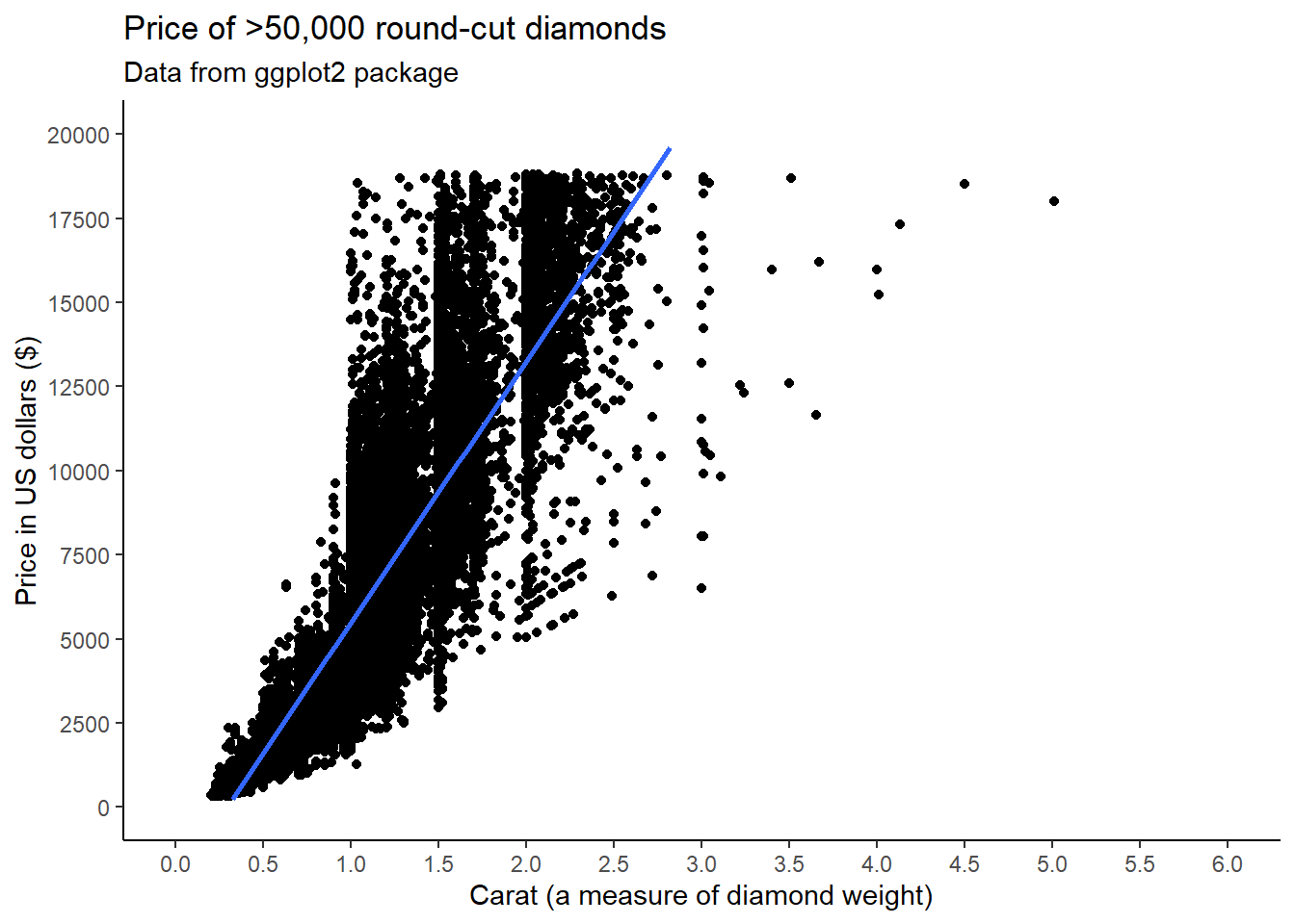
Figure: 5.12: A ggplot object with a geom_point layer, the price of diamonds by their carat, regression line added
5.2.5 Adding groups to ggplot
Looking at our plot, it seems clear that the diamonds seem to stagger a bit, with lots of diamonds at 1, 1.5, 2, 3, and 3.5 carats, and fewer diamonds in the middle of a carat range. There may be something else in the data that helps to explain this . . .
In ggplot, we can easily add a grouping variable to a scatterplot.
All we need to do, is give it a new aesthetic (aes) argument: colour = cut.
diamonds  |>
  ggplot(aes(x = carat, y = price, colour = cut)) +
  geom_point() +
  scale_x_continuous(breaks = seq (0, 6, 0.5), limits = c(0, 6)) +
  scale_y_continuous(breaks = seq(0, 20000, 2500), limits = c(0, 20000)) +
  theme_classic() +
  labs (x = "Carat (a measure of diamond weight)",
        y = "Price in US dollars ($)",
        title = "Price of >50,000 round-cut diamonds",
        subtitle = "Data from ggplot2 package") +
  stat_smooth(method = "lm", se = FALSE)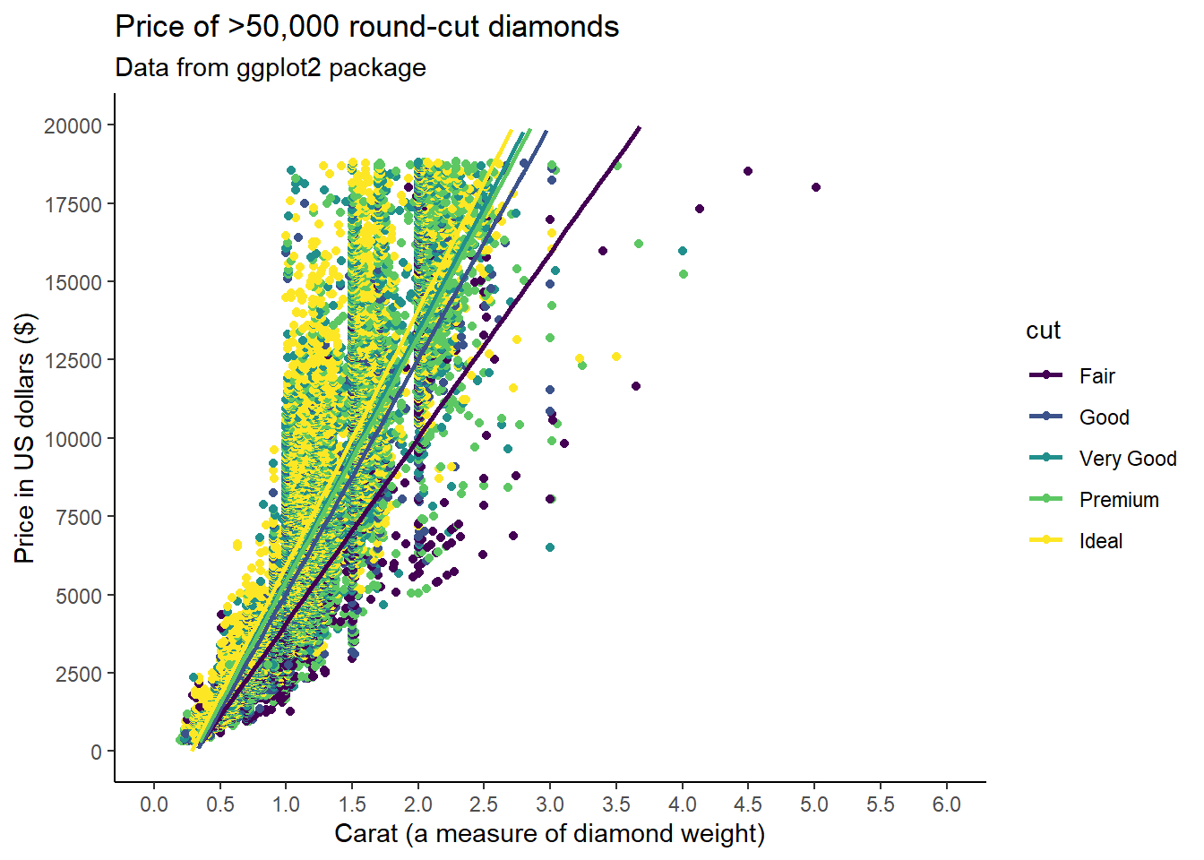
Figure: 5.13: A ggplot object with a geom_point layer, the price of diamonds by their carat and cut, regression line added
This has done quite a lot to our chart - its given us several new lines for each group, and a legend. If your computer is anything like mine, it might be starting to take a few seconds to render this chart. Let’s just do one more thing before we stop playing with this chart.
5.2.6 Changing legends
Using the theme() argument (which is subtly different from the theme_classic() command), we can adjust the legend.
diamonds  |>
  ggplot(aes(x = carat, y = price, colour = cut)) +
  geom_point() +
  scale_x_continuous(breaks = seq (0, 6, 0.5), limits = c(0, 6)) +
  scale_y_continuous(breaks = seq(0, 20000, 2500), limits = c(0, 20000)) +
  theme_classic() +
  labs (x = "Carat (a measure of diamond weight)",
        y = "Price in US dollars ($)",
        title = "Price of >50,000 round-cut diamonds",
        subtitle = "Data from ggplot2 package") +
  stat_smooth(method = "lm", se = FALSE) +
  theme(legend.position = "bottom")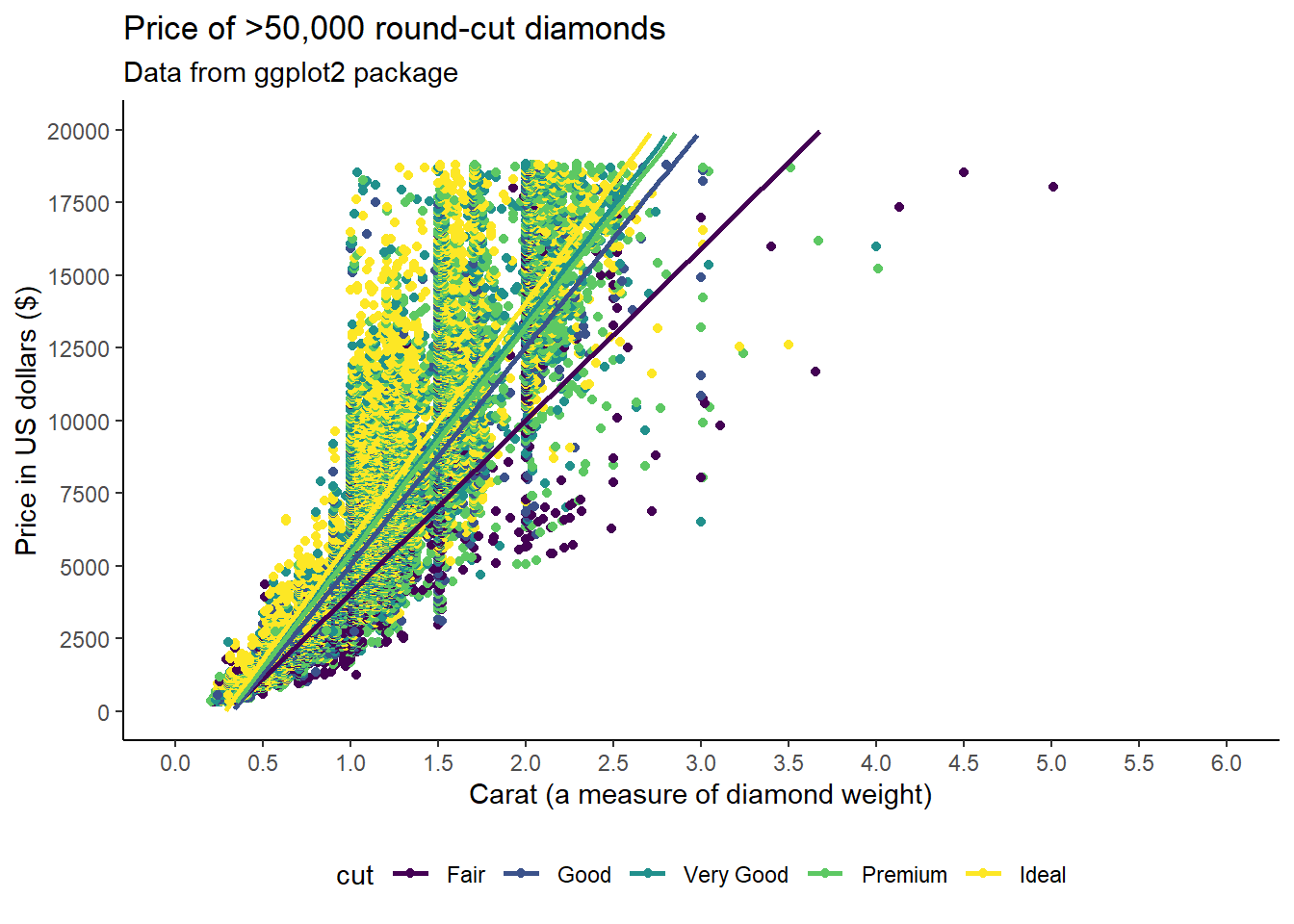
Figure: 5.14: A ggplot object with a geom_point layer, the price of diamonds by their carat and cut, regression line added
But lets say we also want to change the text from ‘cut’ to ‘Cut of Diamond’. Well, you can think of this as another axis we can change. Instead of a scale_x_ we can change the scale_colour_. And this isn’t a continuous scale but a discrete (categorical) one, so we change it with scale_colour_discrete.
diamonds  |>
  ggplot(aes(x = carat, y = price, colour = cut)) +
  geom_point() +
  scale_x_continuous(breaks = seq (0, 6, 0.5), limits = c(0, 6)) +
  scale_y_continuous(breaks = seq(0, 20000, 2500), limits = c(0, 20000)) +
  theme_classic() +
  labs (x = "Carat (a measure of diamond weight)",
        y = "Price in US dollars ($)",
        title = "Price of >50,000 round-cut diamonds",
        subtitle = "Data from ggplot2 package") +
  stat_smooth(method = "lm", se = FALSE) +
  theme(legend.position = "bottom") +
  scale_color_discrete(name = "Cut of Diamond")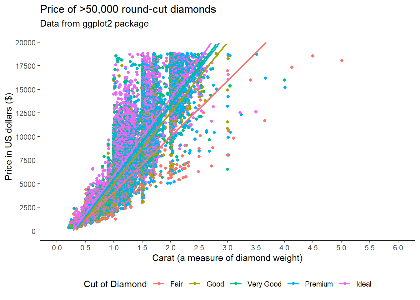
Figure: 5.15: A ggplot object with a geom_point layer, the price of diamonds by their carat and cut, regression line added
Note that using scale_color_discrete has changed the way ggplot2 handles the default colour assignments for the factor. This might give you a clue as to where you might want to look to change the colours on purpose . . .
5.3 Building a boxplot
At this stage, I’m wondering how useful our scatterplot is. Perhaps it would be easier to visualise this with a boxplot. We just need to build a new object.
Lets look to see if there’s a relationship between how big the diamond is (carat) and its clarity (how clear it is).
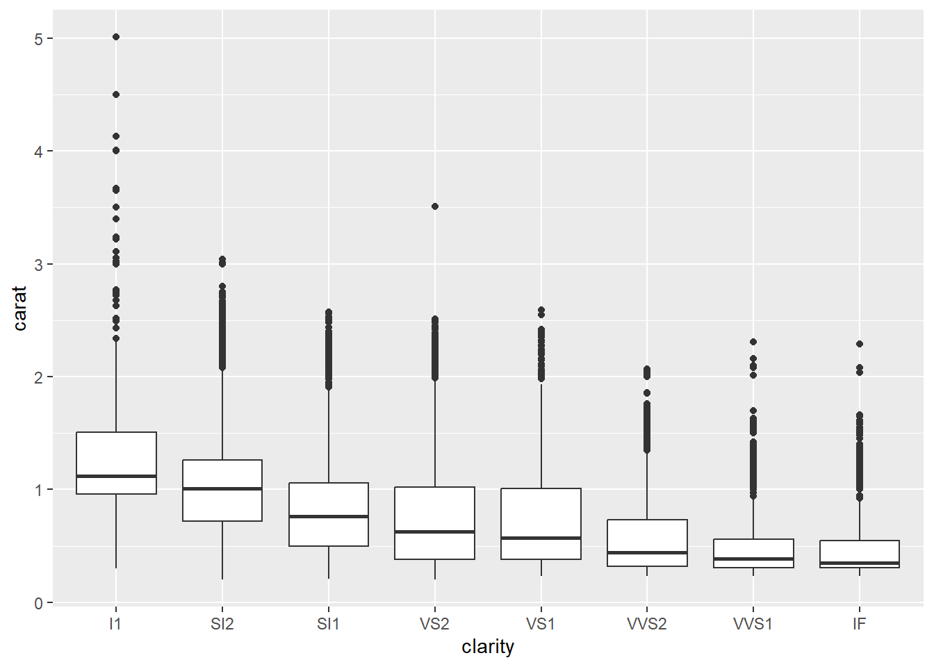
Figure: 5.16: A ggplot object with a geom_boxplot, the carat of diamonds by their clarity
And with just a few lines of code, we can create a very different looking chart:
diamonds  |>
  ggplot(aes(x = clarity, y = carat, colour = clarity)) +
  geom_boxplot() +
  labs(title = "Clarity and carat of >50,000 diamonds",
       subtitle = "Data from ggplot2",
       x = "Clarity (clearness) of diamond",
       y = "Carat (weight) of diamond") +
  theme_classic() +
  theme(legend.position = "none")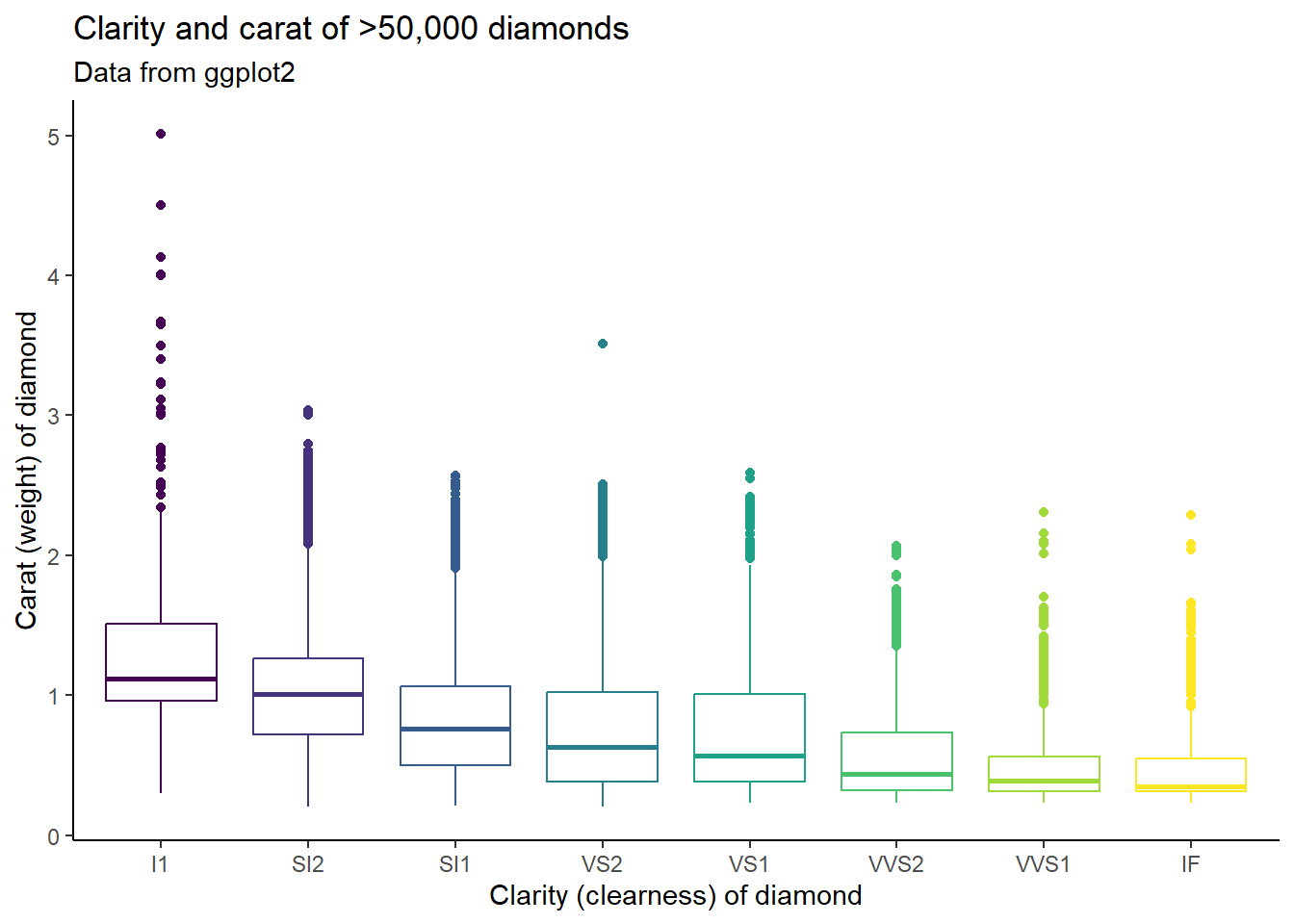
Figure: 5.17: A ggplot object with a geom_boxplot, the carat of diamonds by their clarity
5.4 Facets
Another very useful command is ‘facet’, which splits one chart into many based on a particular variable.
diamonds  |>
  ggplot(aes(x = clarity, y = carat, colour = clarity)) +
  geom_boxplot() +
  labs(title = "Clarity, cut and carat of >50,000 diamonds",
       subtitle = "Data from ggplot2",
       x = "Clarity (clearness) of diamond",
       y = "Carat (weight) of diamond") +
  theme_classic() +
  theme(legend.position = "none") +
  facet_wrap(facets = ~cut)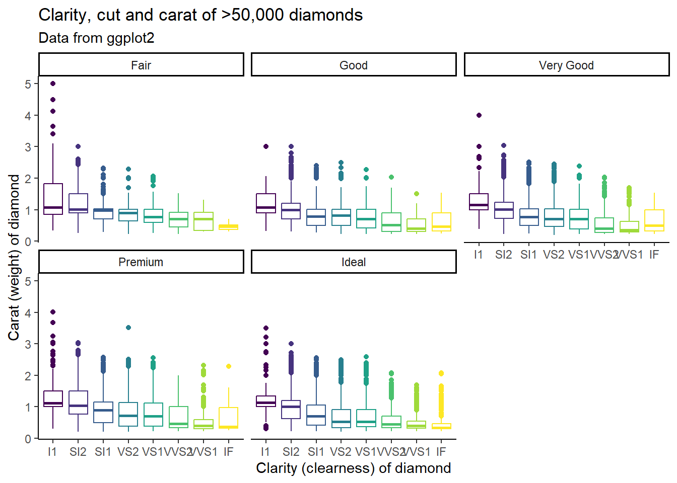
Figure: 5.18: A ggplot object with a geom_boxplot, the carat of diamonds by their clarity
5.5 Bar charts
To create a bar chart, we simply need to change the geom_boxplot() to a geom_bar argument with a stat="summary" specification.
diamonds |>
  ggplot(aes(x = clarity, y = carat, fill = clarity)) +
  geom_bar(stat = "summary") +
  labs(title = "Clarity, cut and carat of >50,000 diamonds",
       subtitle = "Data from ggplot2",
       x = "Clarity (clearness) of diamond",
       y = "Carat (weight) of diamond") +
  theme_classic() +
  theme(legend.position = "none") +
  facet_wrap(facets = ~cut)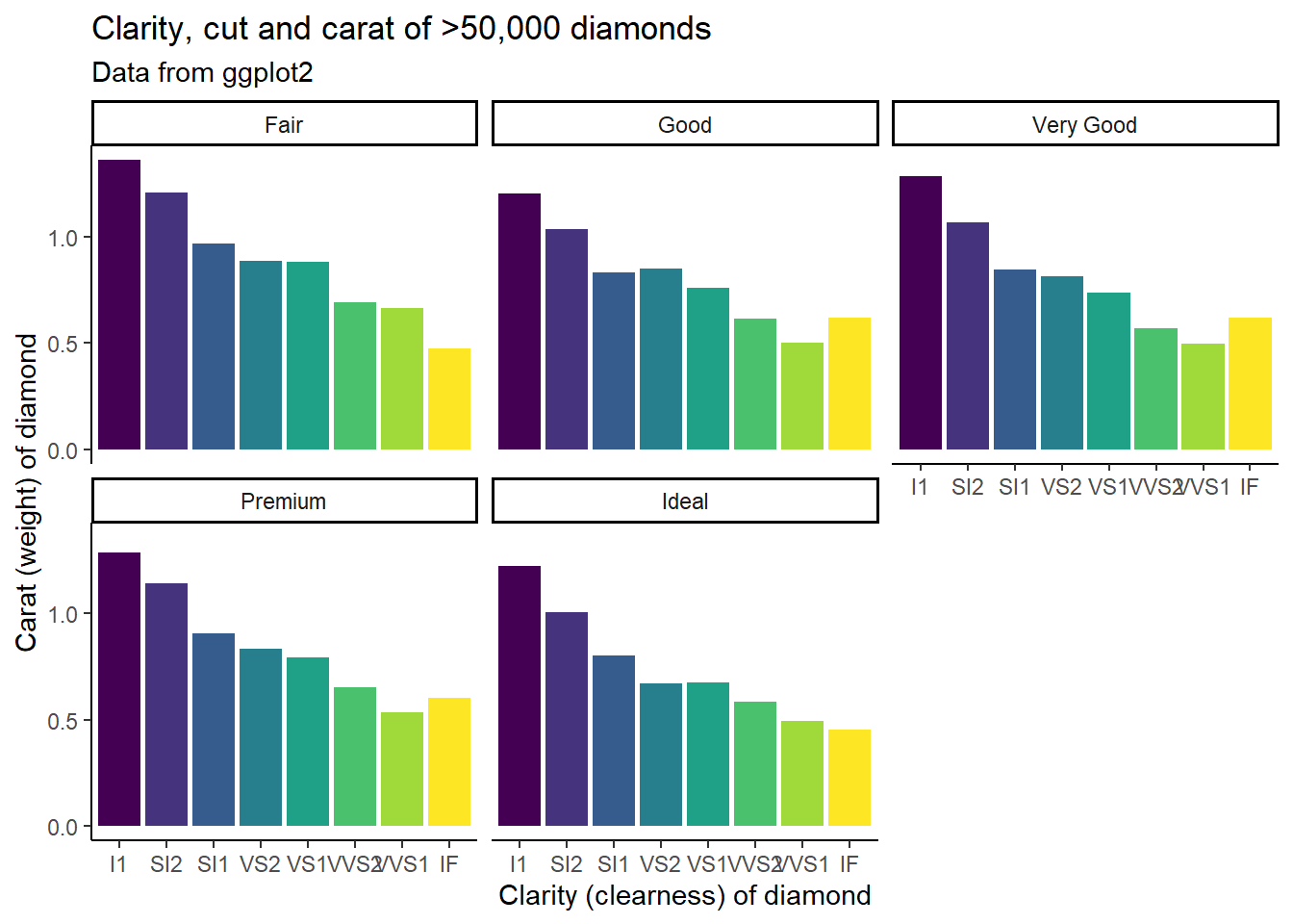
Figure: 5.19: A ggplot object with a geom_bar, the carat of diamonds by their clarity
There are a few notes here.
Within
geom_barwe have set the argumentgeom_bar(stat = "summary"). This tells R to calculate the mean carat for each group. Note as well that the groups are nested (we are calculating the mean carat for each clarity grouping inside each cut grouping).geom_barwantsfill = clarityinstead ofcolour = clarity, as it treatscolouras the line around the bar. If you’re anything like me you will always forget this and change the colour of the bar plot lines instead of its fill.
5.6 Exercise
Please feel free to google and explore these questions - as well as putting your own customisation touches.
Create a boxplot of the mpg cars dataset, plotting highway miles (hwy) against the car type (class)
Answer here
Create a histogram of the number of miles per gallon in the city (cty) faceted by type of transmission (trans)
Answer here
5.7 Videos
If you’d rather watch a video about this - you can here!
5.8 Useful resources
There are some very useful resources out there about ggplot2 including:
Cookbook for R, Winston Chang’s (free) online book about using ggplot
ggplot cheatsheet, a pdf with lots of neat visualisations and cheats.