Chapter 4 Charts
You can skip this chapter if . . .
-
You are confident you know the difference between a bar chart, histogram, scatterplot and line chart.
-
You are confident you can read and interpret charts.
-
You know what bad charts look like
4.1 Data Visualisation
Data visualisation is one of the most important skills a scientst can learn, and being able to identify good and bad data visualisation will make you the life and soul of every party, and incredibly popular at all times.
In this chapter, we’re not going to look at any R code. Instead we’re going to think about what data visualisation means.
4.1.1 When charts go bad
Lets take a look at Figure 4.1.
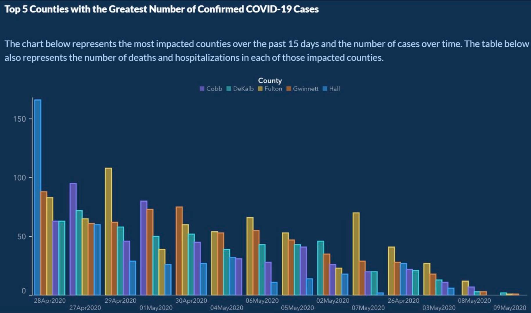
Figure: 4.1: US State of Georgia, COVID-19 Deaths, Source: https://ftalphaville.ft.com/2020/05/18/1589795135000/When-axes-get-truly-evil/
There is an excellent article from the Financial Times about this chart. I think this chart is a great example of why data visualisation is important.
We use charts to communicate large amounts of data quickly and easily.
Often, in life, we are trying to communicate something important. We are often trying to persuade someone to do something, like give us more research money, or to make a change that we want to see.
What message do you think Figure 4.1 is trying to communicate?
If you look at the x axis (the one that goes across the graph), what order are the dates in?
4.1.2 Chart anatomy
4.1.2.1 The two-axes rule
Most charts will have two axes:
The x axis which goes across the chart
The y axis which goes up the chart (upp-y/down-y was how I used to remember it).
As in data science we are often interested in does x affect y, we usually put the explanatory variable on the x axis. We try to always have the thing that drives variation going across the chart, whereas the thing that responds to variation goes up and down the chart. (The response-y variable.)
You should always think about your axes - and they should be clear to the reader from the beginning. No messing with the order (see again Figure 4.1).
Unless you have a very good reason, I would always have two axes. That means if you’re trying to put in a second Y axis, you are breaking the two-axes rule, and should re-evaluate your chart. If you’re trying to make a pie-chart, you are breaking the two-axes rule, and should re-evaluate your chart.
Follow the two-axes rule, and your life will be a lot easier.
4.1.2.2 Why I hate pie charts
Pie charts are the worst visualisation in the world.
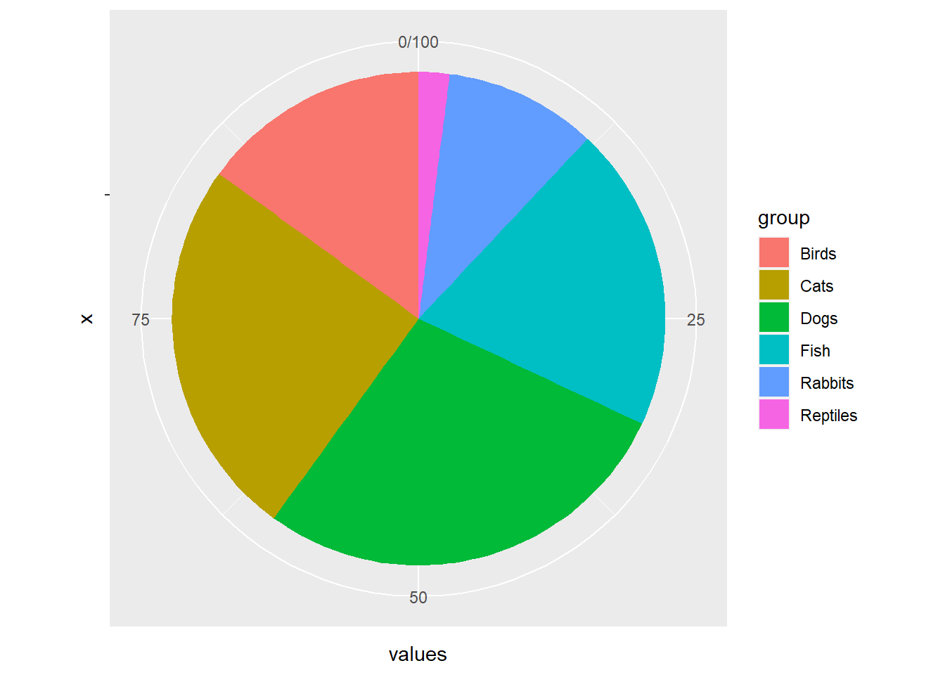
Figure: 4.2: The worst kind of chart describing proportion of people with type of pet (fictional data)
Let’s take Figure 4.2 as an example. What proportion of people have a dog versus a cat. I’ll wait for you to start puzzling through that question.
It’s very hard to distinguish between a pie slice that’s 2/5ths versus a pie slice that’s 2/7ths. Many people put labels on their pie charts, but if I need to read the label to understand the difference, why not just put the text in a table?
Instead a bar chart shows use the exact ranking of this data and we can see how many more people have cats versus birds.
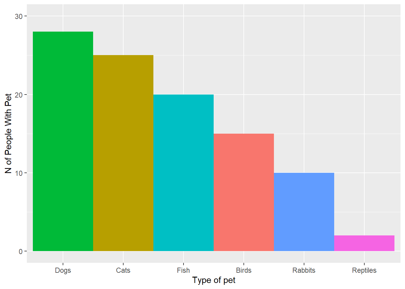
Figure: 4.3: A much better chart describing proportion of people with type of pet (fictional data)
4.1.2.4 Legends
Like figure headings, legends should be informative and clear. They will always describe a categorical variable, and sometimes their job will be done by the x axis.
4.1.2.5 Colours
The use of colours in charts is a curious thing. Colour can be very useful in a chart, but also very distracting. There’s another brilliant FT article on the use of colour to indicate gender in charts and all the ensuing complications. (University of Edinburgh folk can log in to the FT for free).
4.1.2.5.1 Advanced R users
If you have gotten really into R, or you really like pretty colours, I highly recommend checking out Emil Hvitfeldt’s well maintained repository listing all the R colour palette packages out there. Personally I really like nord8 and LaCroixColoR and NineteenEightyR. Much of my life is spent tweaking colours on charts.
4.1.3 Bar charts
Bar charts are good for describing a continuous (numerical) variable by a categorical (grouping) variable. When you are describing a continuous variable by a categorical variable, you are usually describing the mean of that category, but it can also be the median, or other measures. For example:
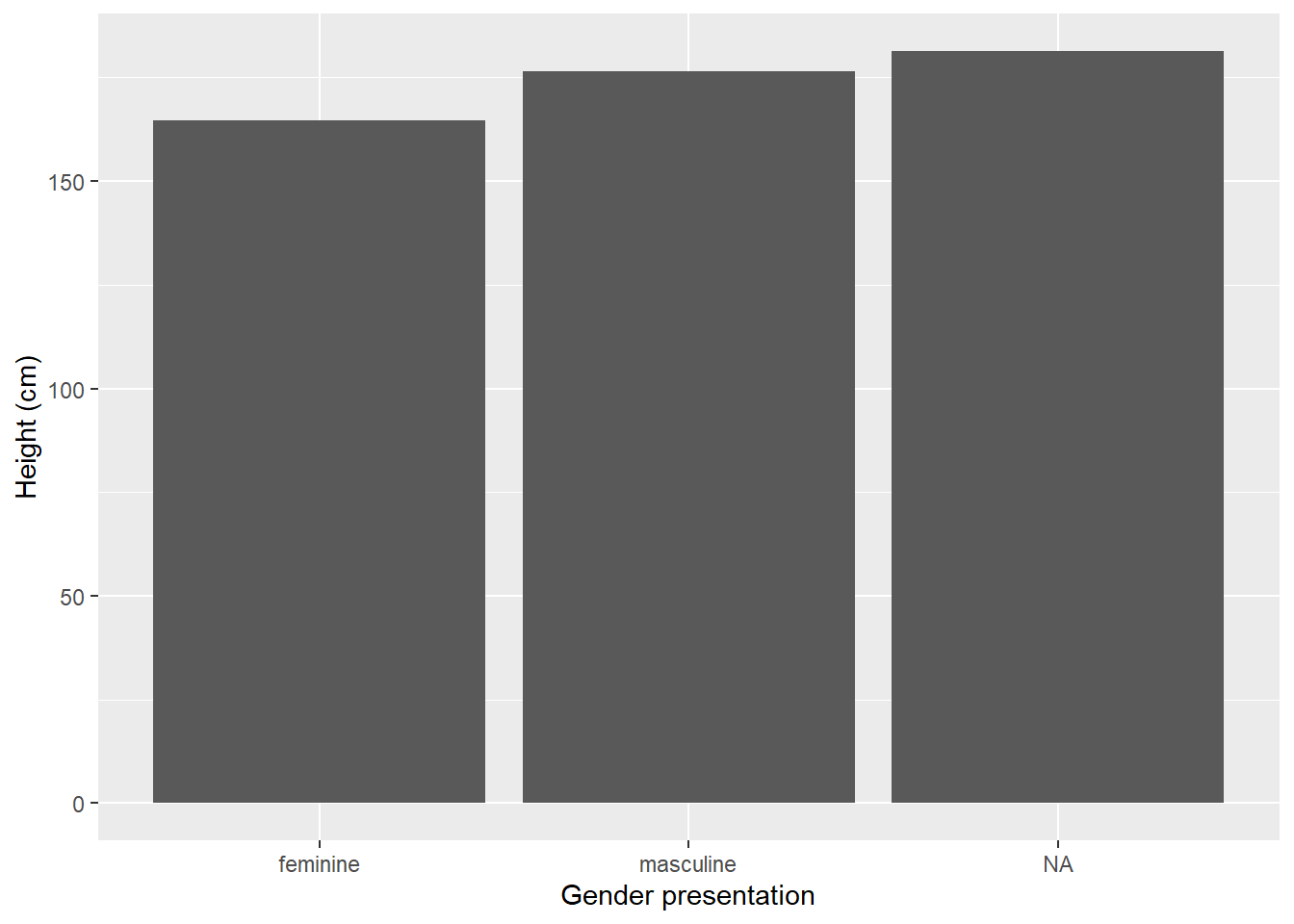
Figure: 4.4: Average height (cm) of Star Wars characters by gender
They can also be flipped around, particularly if the axis text is hard to read in one particular direction:
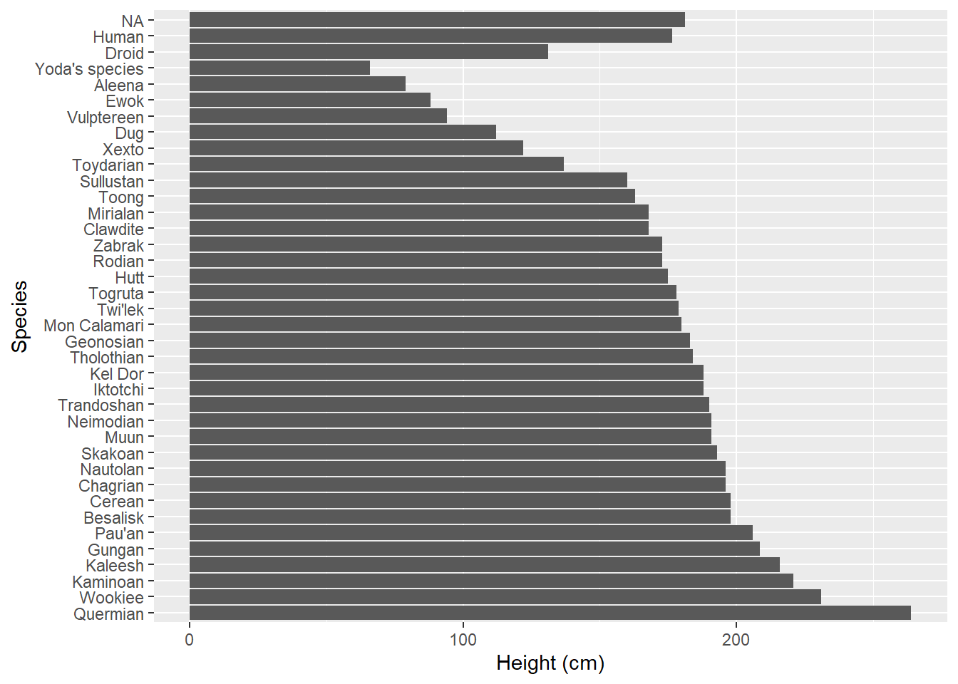
Figure: 4.5: Average height (cm) of Star Wars characters by species
4.1.4 Histograms
A histogram shows the relative frequency of a continuous variable. For example we can see the most common height of Star Wars characters, with 20 characters, is around 180cm:
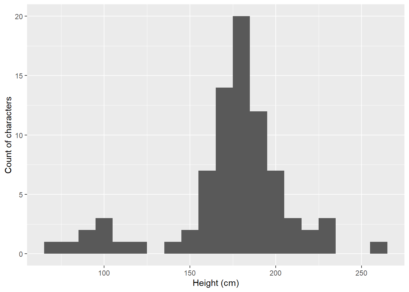
Figure: 4.6: Histogram of height (cm) of Star Wars characters
4.1.5 Scatterplots
Scatterplots are good for showing the relationship between two continuous variables.
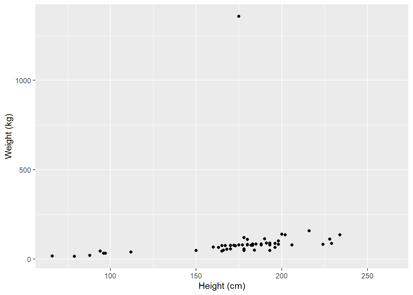
Figure: 4.7: Average height (cm) of Star Wars characters by weight (kg)
But we can use other aspects, such as shape or colour, to add in a categorical variable:
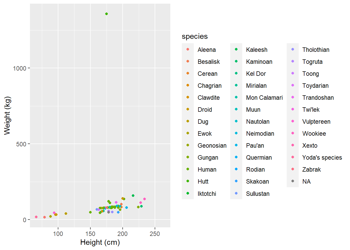
Figure: 4.8: Average height (cm) of Star Wars characters by weight (kg) and species
4.1.6 Boxplots
Boxplots are another way to examine a continuous variable by a categorical variable, but they give us a lot more information than a bar plot does.
A boxplot shows you:
The median value (the thick bar in the middle)
The first quartile (the lowest part of the bar)
The third quartile (the highest part of the bar)
A lower hinge (the bottom thin line) which roughly equates to 95% of the data will not be below this value.
An upper hinge (the top thin line) which roughy equates to 95% of the data will not be above this value.
Any outliers (the dots) which are observations which lie outside of 95% of the data9
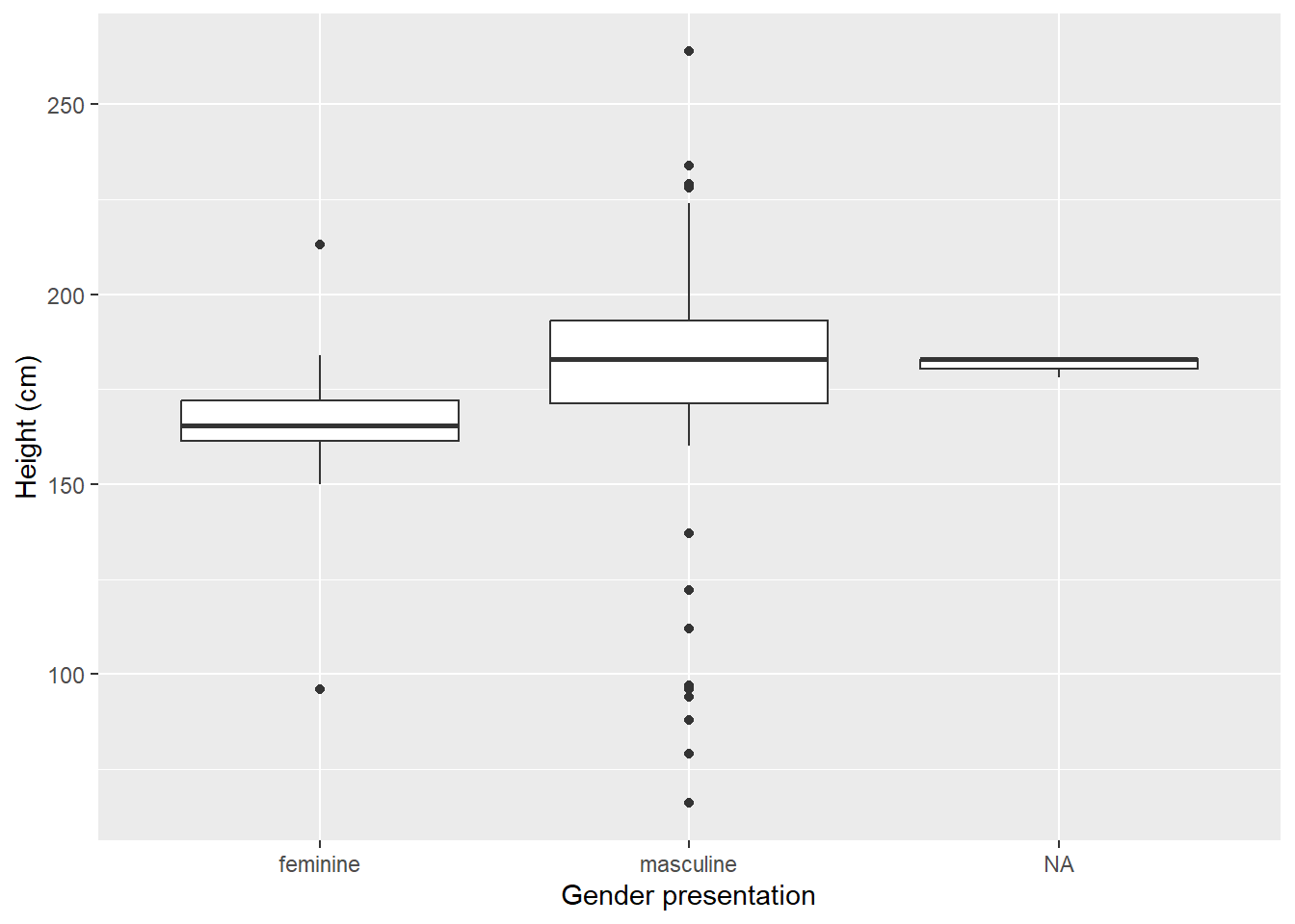
Figure: 4.9: Average height (cm) of Star Wars characters by gender
4.1.7 Infographics
In our increasingly connected world, we are seeing more and more infographics. As they’re less standardised, there can be more room for interpretation. For example;
As an Indian woman, I can confirm that too much of my time is spent hiding behind a rock praying the terrifying gang of international giant ladies and their Latvian general don't find me pic.twitter.com/sy9NHW9oTK
— Sabah Ibrahim (@reina_sabah) August 6, 2020
Infographics can be extremely powerful, particularly when trying to communicate on social media. Unfortunately, sometimes the design choices can make it harder to understand exactly what the analysis has done. Infographics can be as misleading as bad charts.
In general, I would focus on chart visualisations over infographics, even for public engagement. When you are very confident with making clear and readable charts, then you can start to think about infographics.