This code will help you replicate the charts in Lecture 2
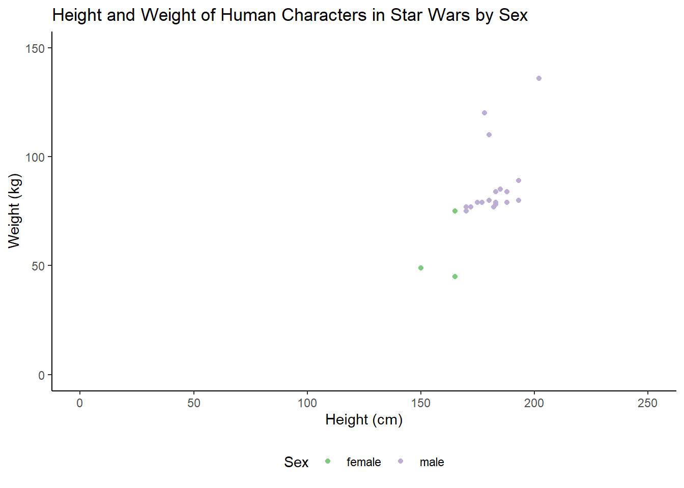
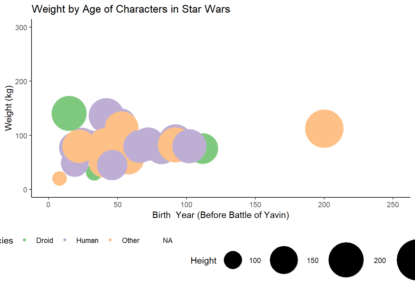
Height vs Weight by Sex
starwars |>filter(species =="Human") |>ggplot(aes(x = height, y = mass, colour = sex)) +geom_point() +theme_classic() +scale_x_continuous(limits =c(0,250)) +scale_y_continuous(limits =c(0,150)) +scale_colour_brewer(palette ="Accent", name ="Sex") +theme(legend.position ="bottom") +labs(x ="Height (cm)",y ="Weight (kg)",title ="Height and Weight of Human Characters in Star Wars by Sex")
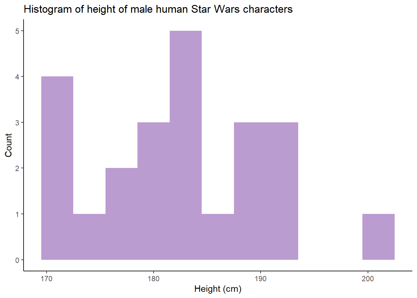
Histogram of male height
starwars |>filter(species =="Human", sex =="male") |>ggplot(aes(x = height)) +geom_histogram(binwidth =3, fill ="#bb9cd1") +theme_classic() +labs(x ="Height (cm)",y ="Count",title ="Histogram of height of male human Star Wars characters")
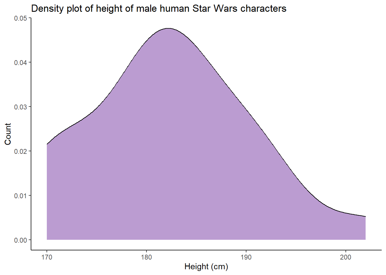
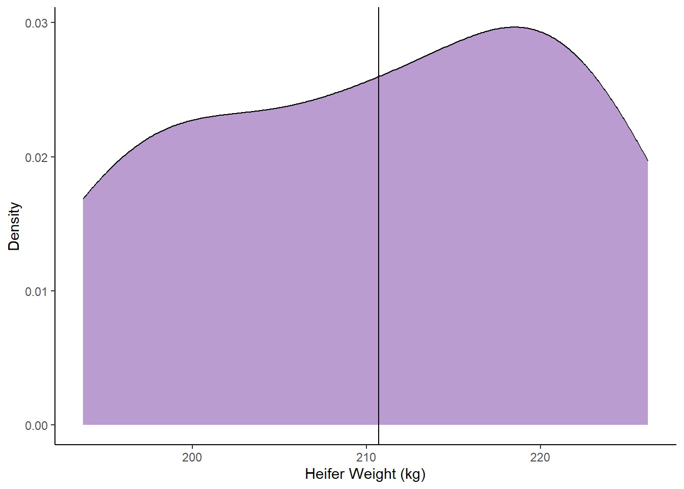
Density plot of male height
starwars |>filter(species =="Human", sex =="male") |>ggplot(aes(x = height)) +geom_density(fill ="#bb9cd1") +theme_classic() +labs(x ="Height (cm)",y ="Count",title ="Density plot of height of male human Star Wars characters")
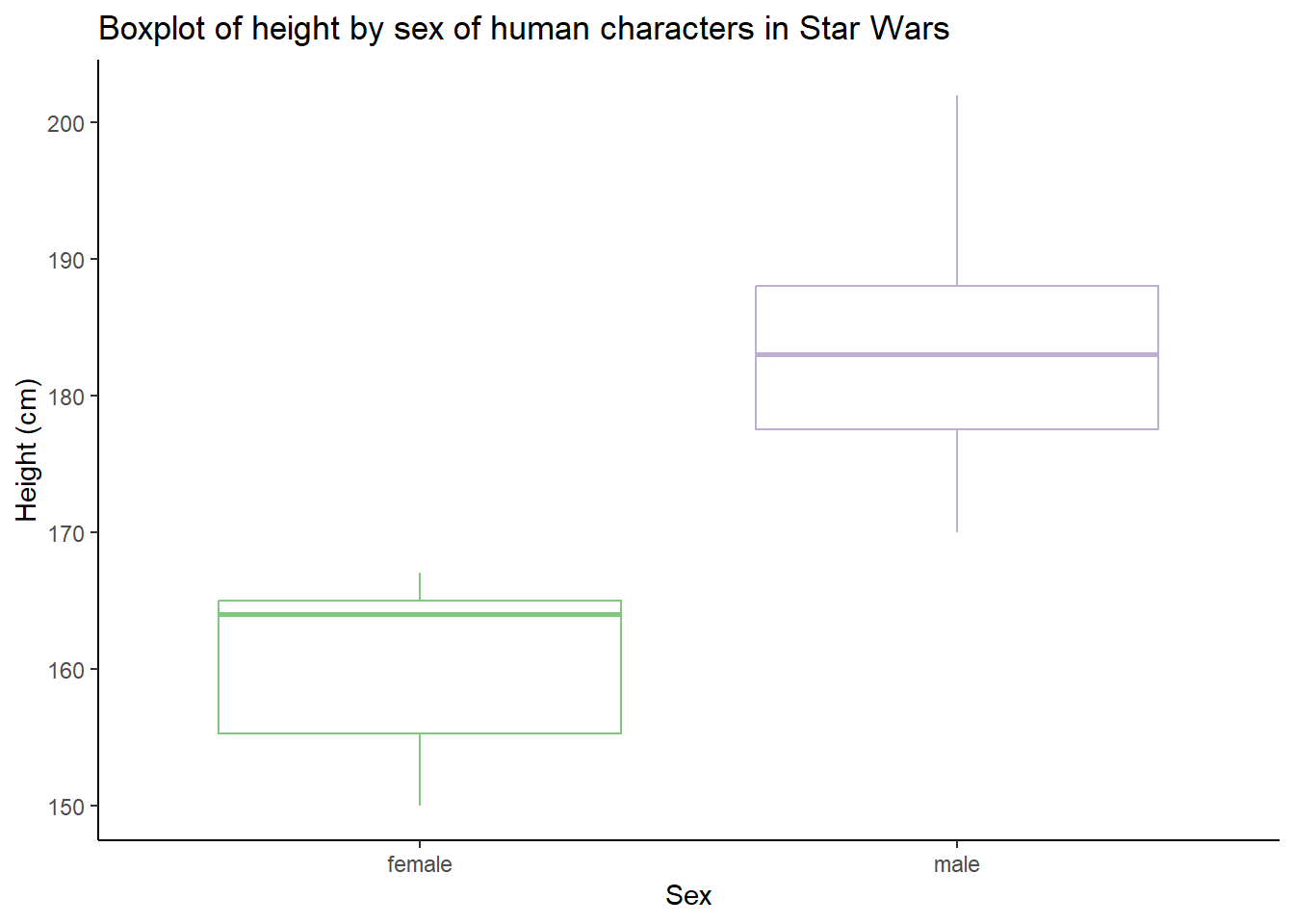
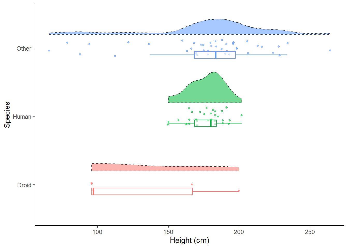
Boxplot of height
starwars |>filter(species =="Human") |>ggplot(aes(y = height, x = sex, colour = sex)) +geom_boxplot() +theme_classic() +scale_colour_brewer(palette ="Accent", name ="Sex") +labs(y ="Height (cm)",x ="Sex",title ="Boxplot of height by sex of human characters in Star Wars") +theme(legend.position ="none")
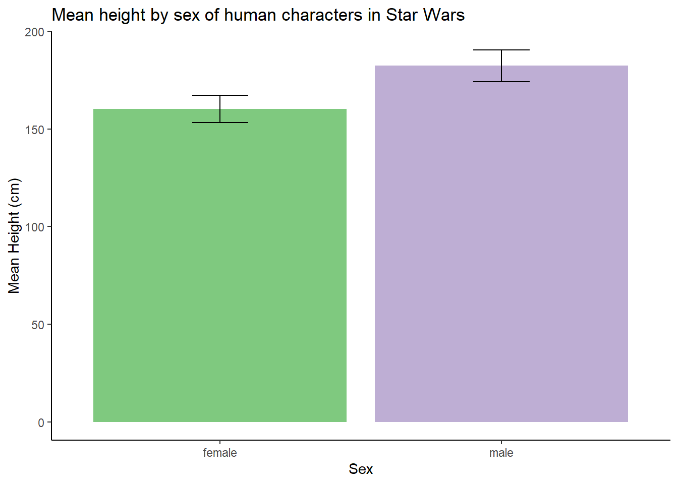
Mean height (bar chart)
starwars |>filter(species =="Human") |>group_by(sex) |>summarise(ht =mean(height, na.rm =TRUE),sd =sd(height, na.rm =TRUE)) |>ggplot(aes(x = sex, y = ht, fill = sex)) +geom_bar(stat ="identity") +geom_errorbar(aes(ymin = ht-sd, ymax = ht+sd), width =0.2)+scale_fill_brewer(palette ="Accent") +labs(y ="Mean Height (cm)",x ="Sex",title ="Mean height by sex of human characters in Star Wars") +theme_classic() +theme(legend.position ="none")
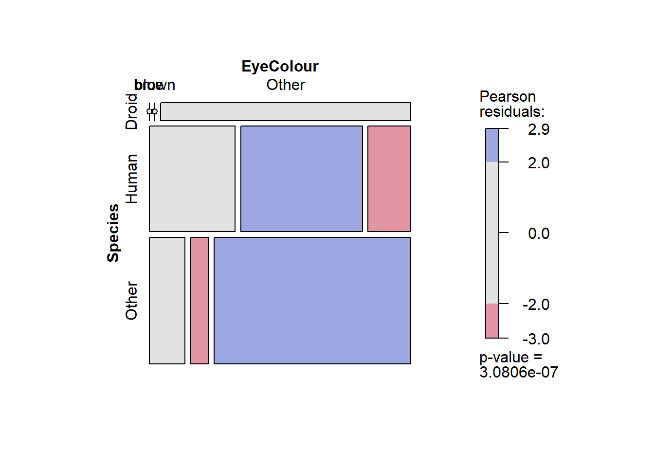
Mosaic Plot
library(vcd)startbl <- starwars |>mutate(Species =fct_lump_n(species, 2),EyeColour =fct_lump_n(eye_color,2)) mosaic(~ Species + EyeColour, data = startbl,shade =TRUE, legend =TRUE)
wage |>ggplot(aes(x = Median)) +geom_density(fill ="#bb9cd1") +theme_classic() +geom_vline(aes(xintercept =34475)) +labs(x ="UK Salaries (£)",y ="Density",title ="Distribution of UK Salaries",caption ="Data taken from ONS 2023 Median Salaries by Field, n = 329 fields")
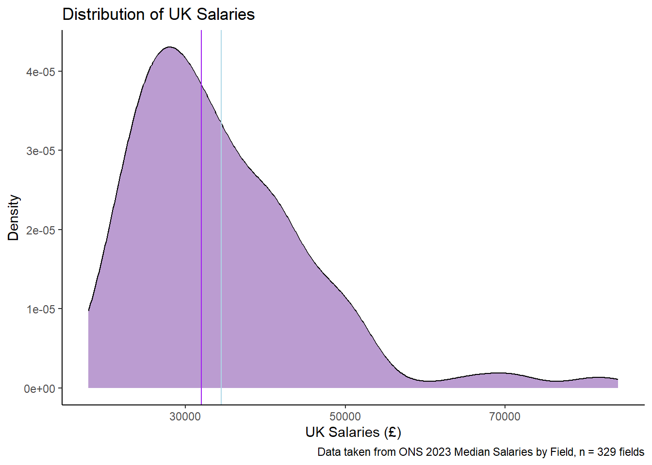
wage |>ggplot(aes(x = Median)) +geom_density(fill ="#bb9cd1") +theme_classic() +geom_vline(aes(xintercept =34475), colour ="lightblue") +geom_vline(aes(xintercept =31988),colour ="purple") +labs(x ="UK Salaries (£)",y ="Density",title ="Distribution of UK Salaries",caption ="Data taken from ONS 2023 Median Salaries by Field, n = 329 fields")